Brand Identity Kit
An Able Mind Sees
What Others Miss
The visual system and the assets. Everything you need to represent us.
EST. 2026 · abellminded.com
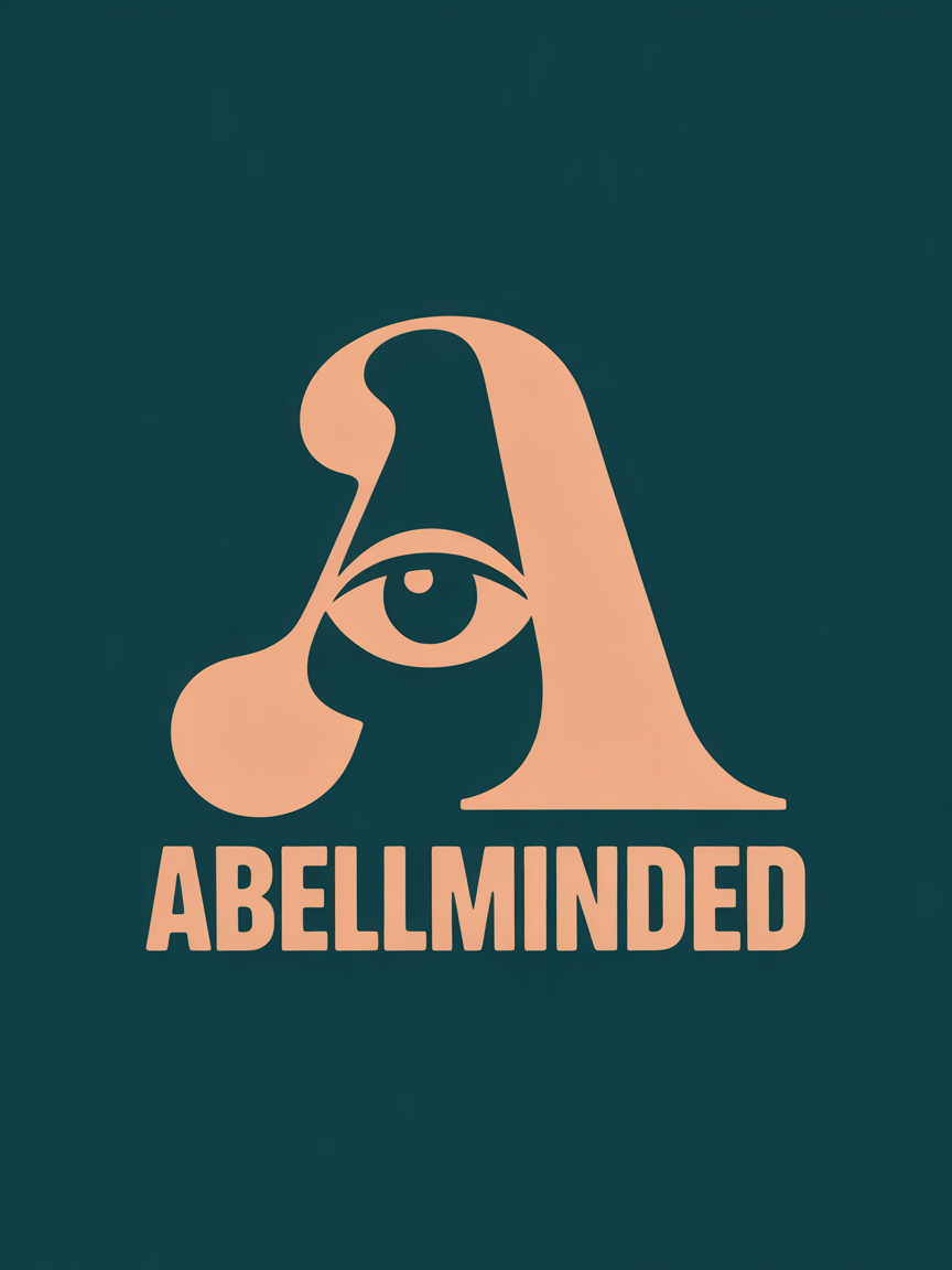
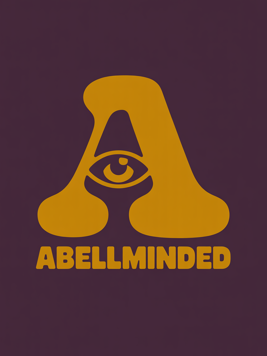
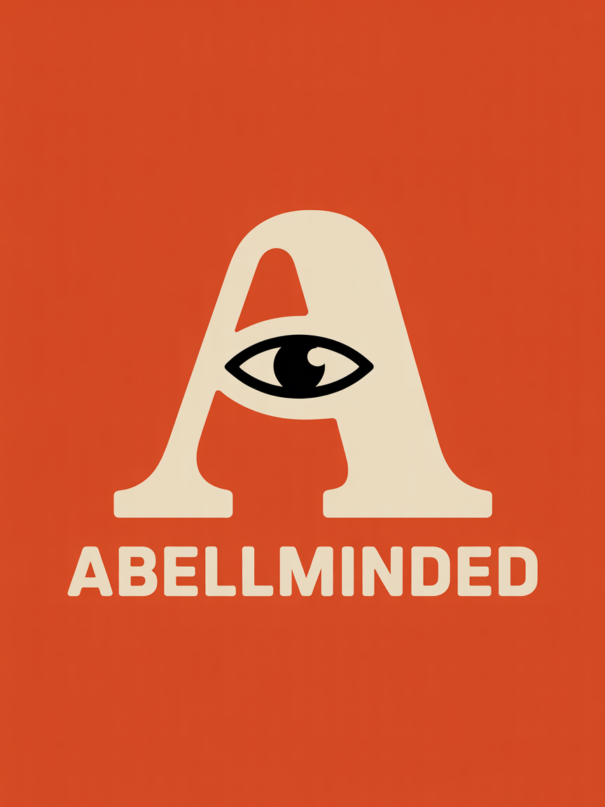
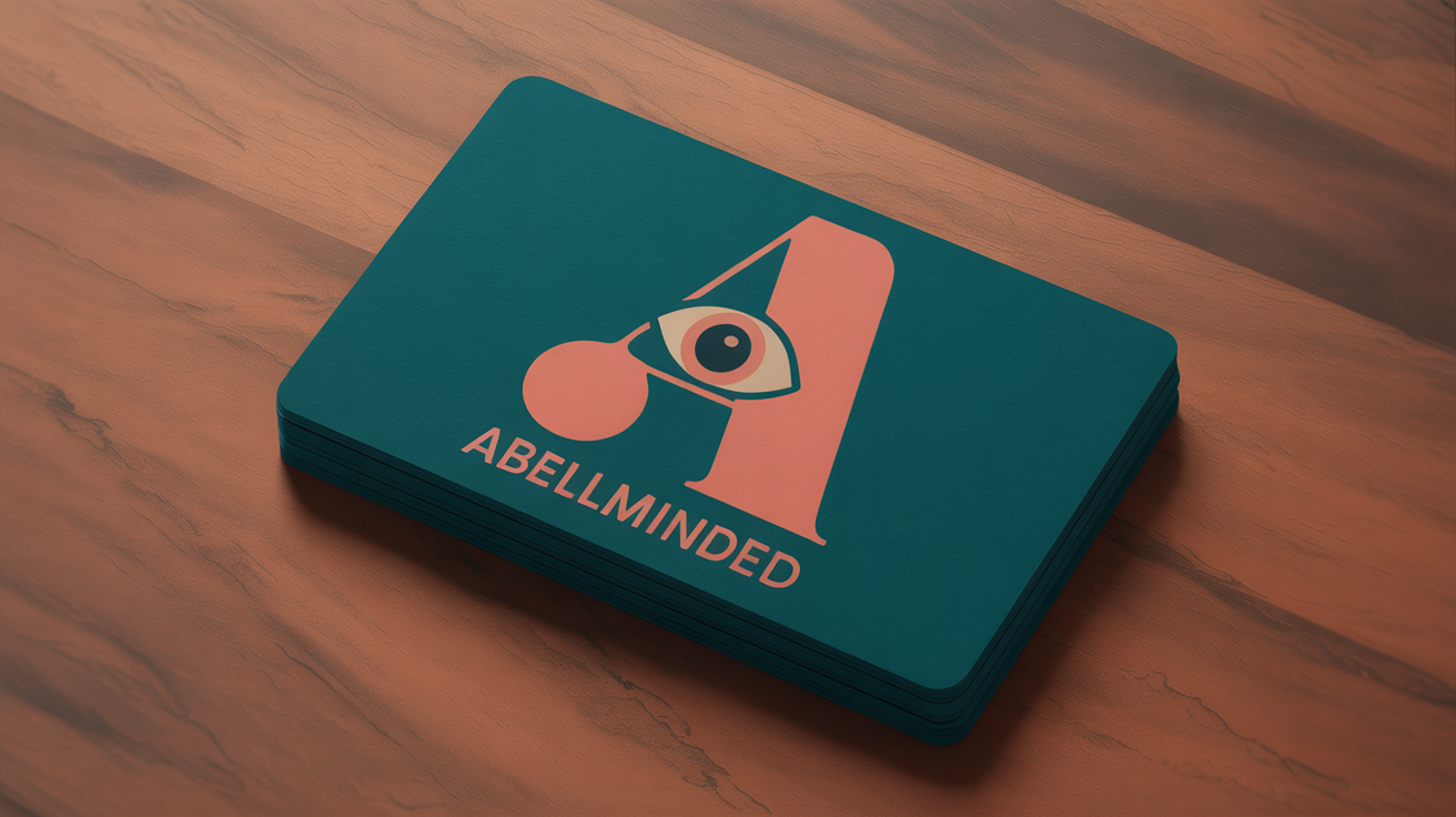
Logo System
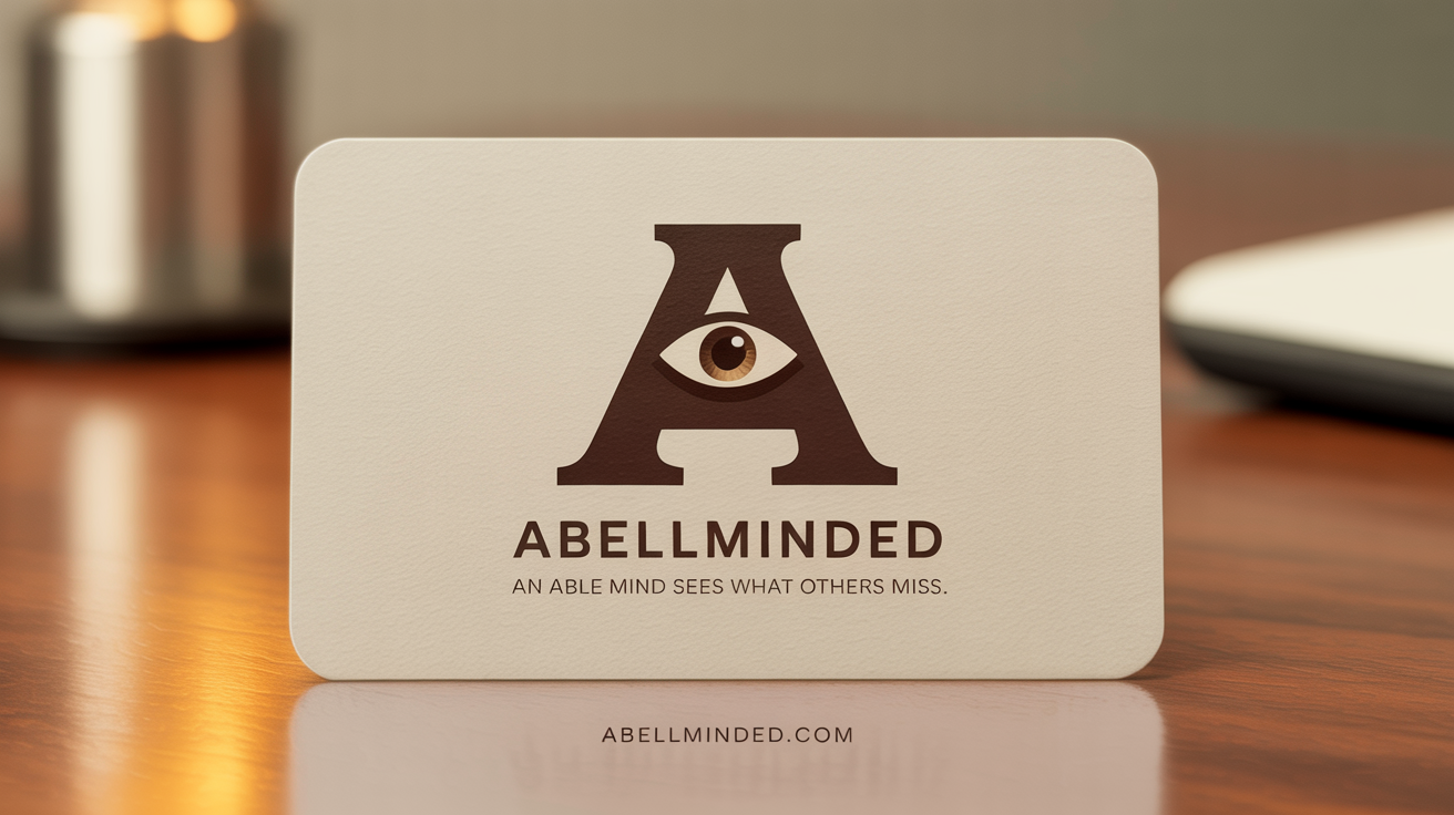
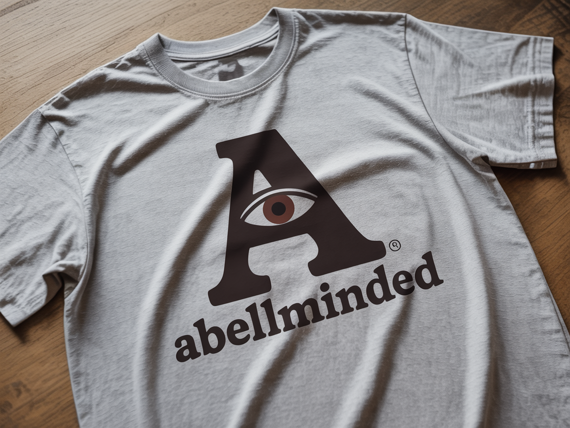
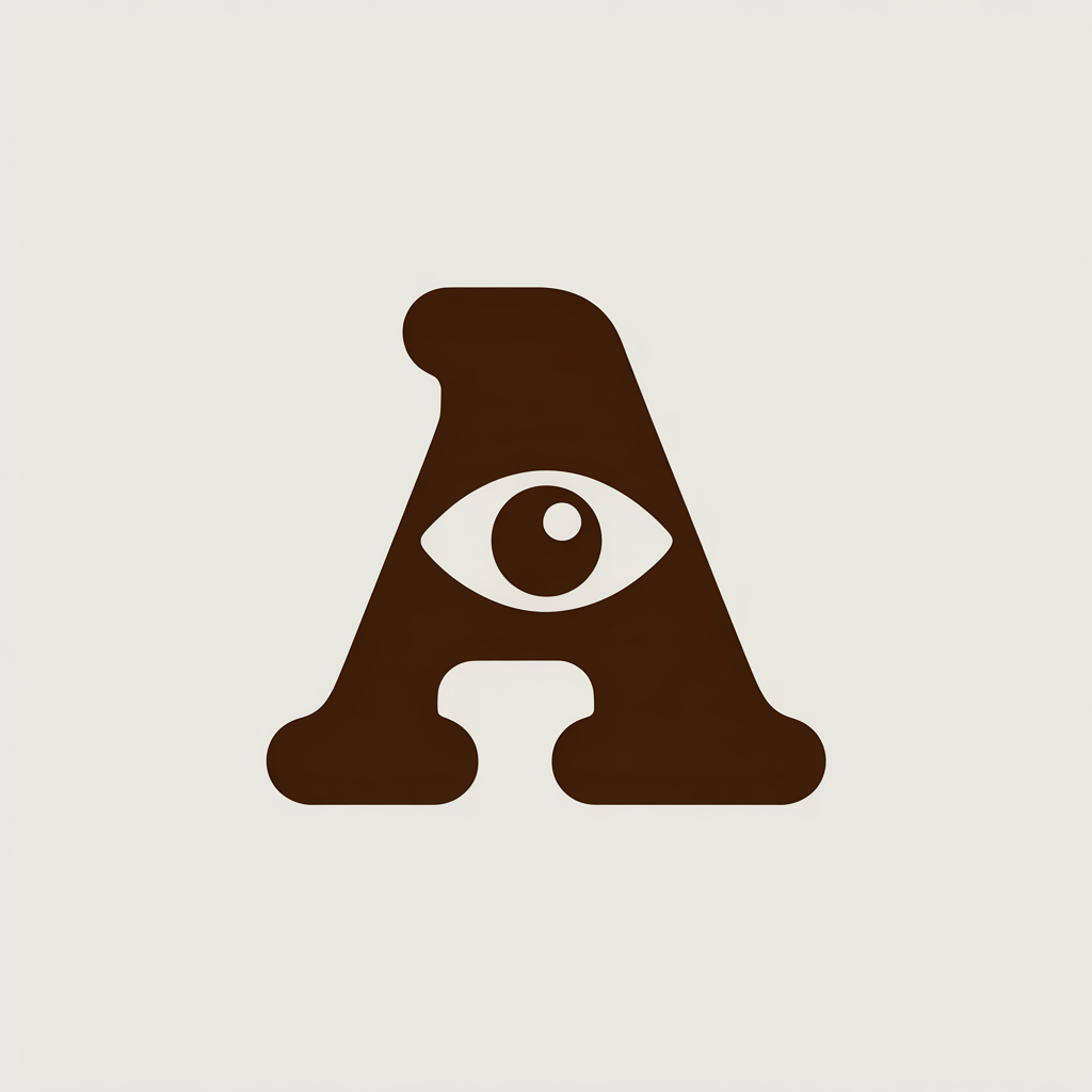
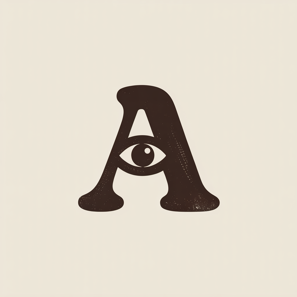
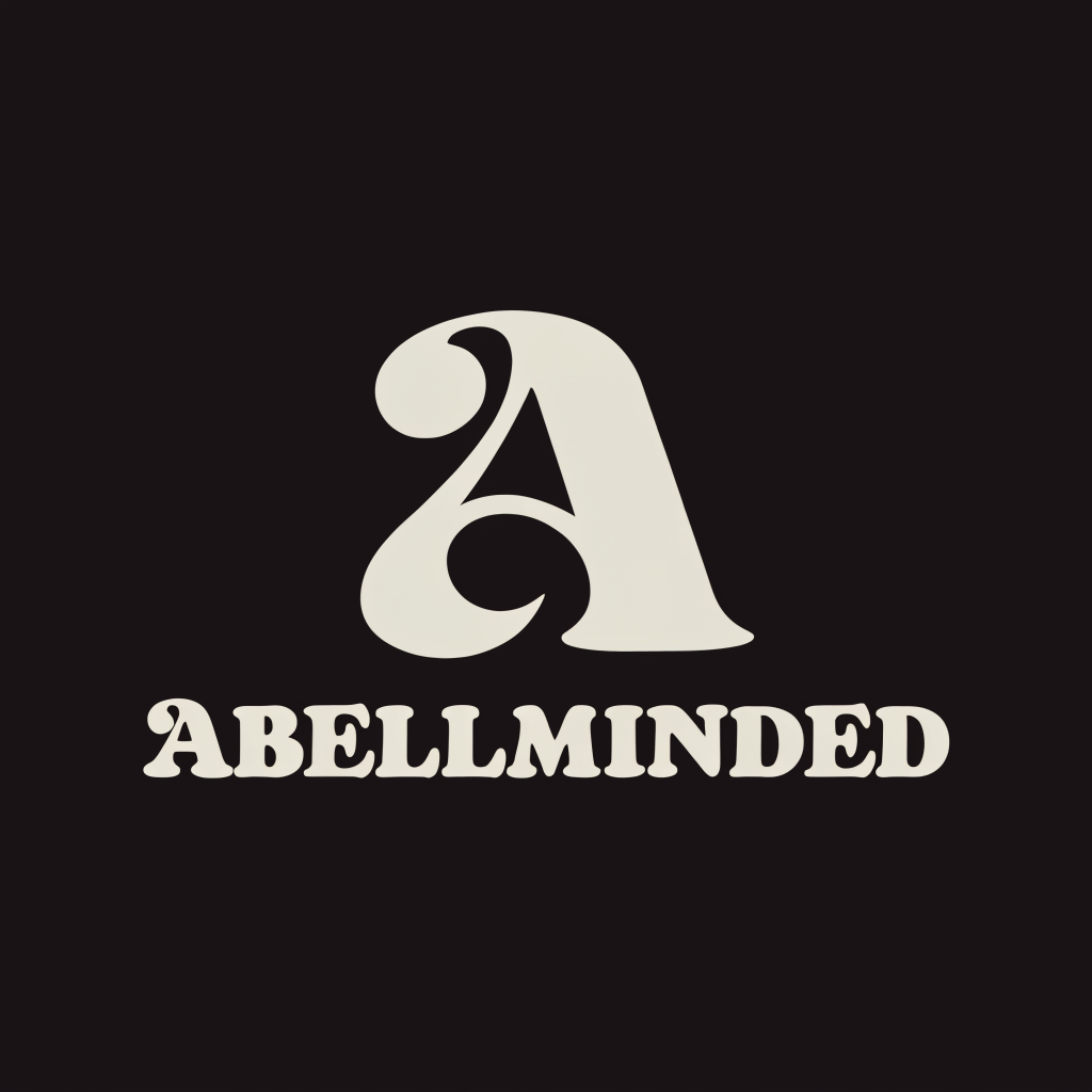
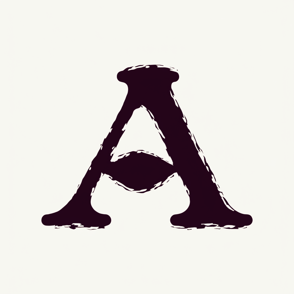
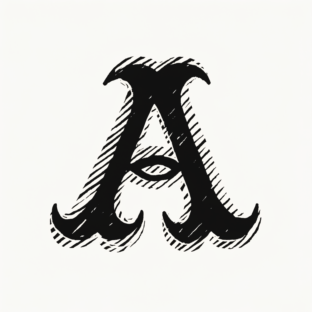
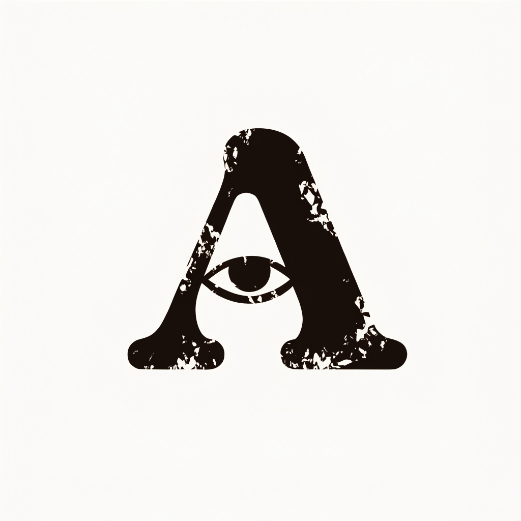
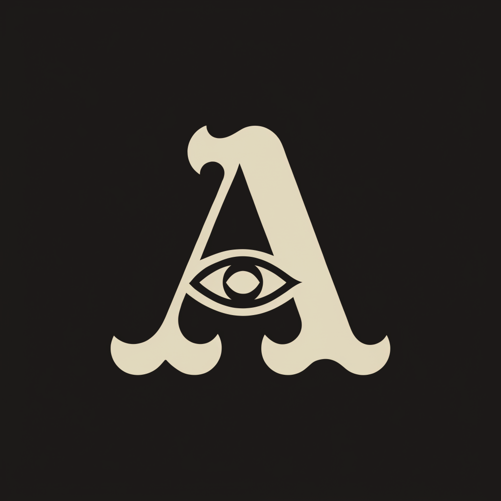
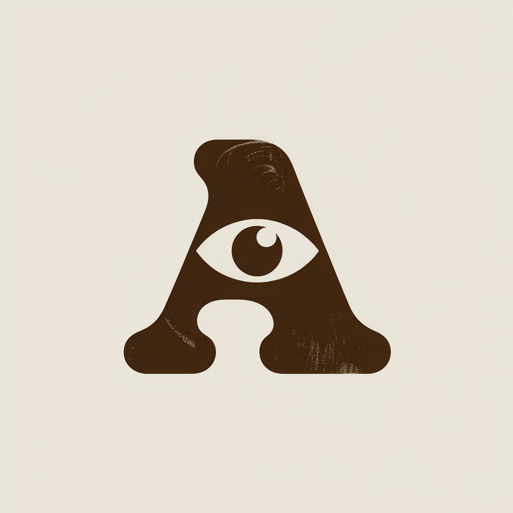
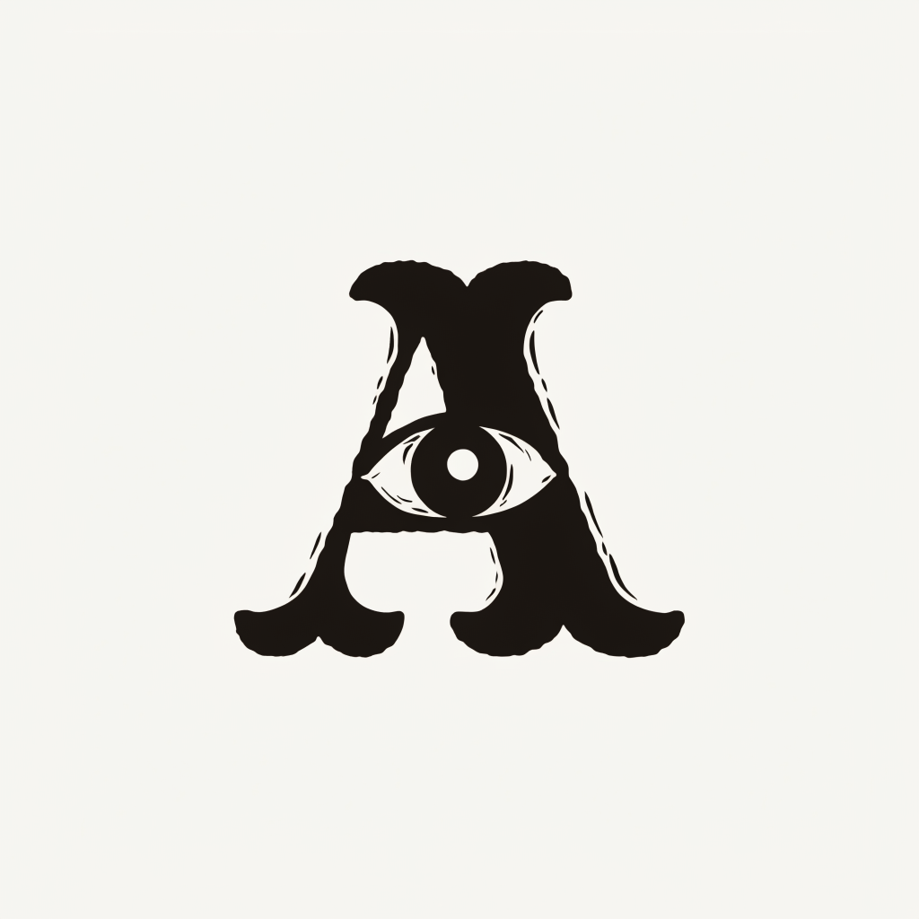
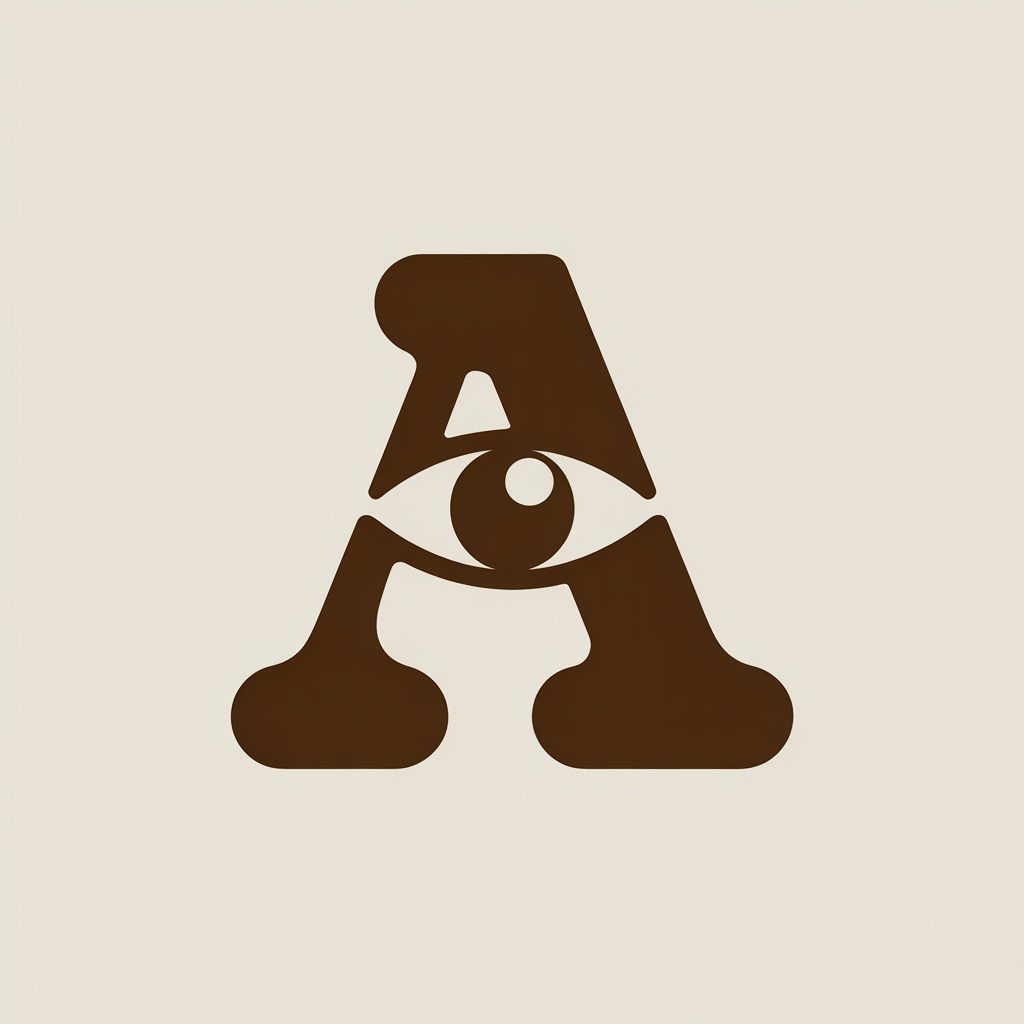
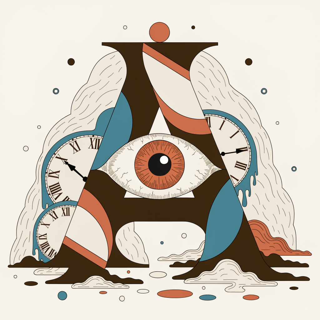
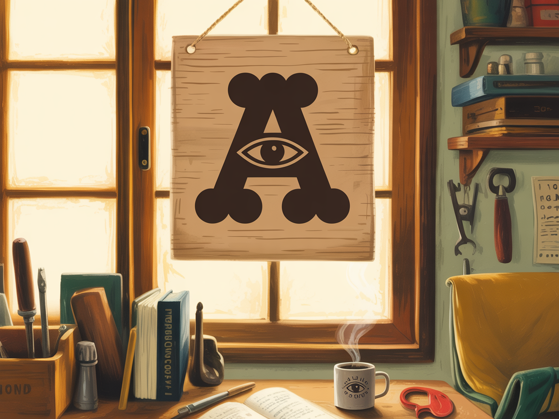
The A-Eye: a Cooper-style serif A with a single eye in the counter. The wordmark: ABELLMINDED in Recoleta Bold, all caps. Together or apart.
Mark + Wordmark
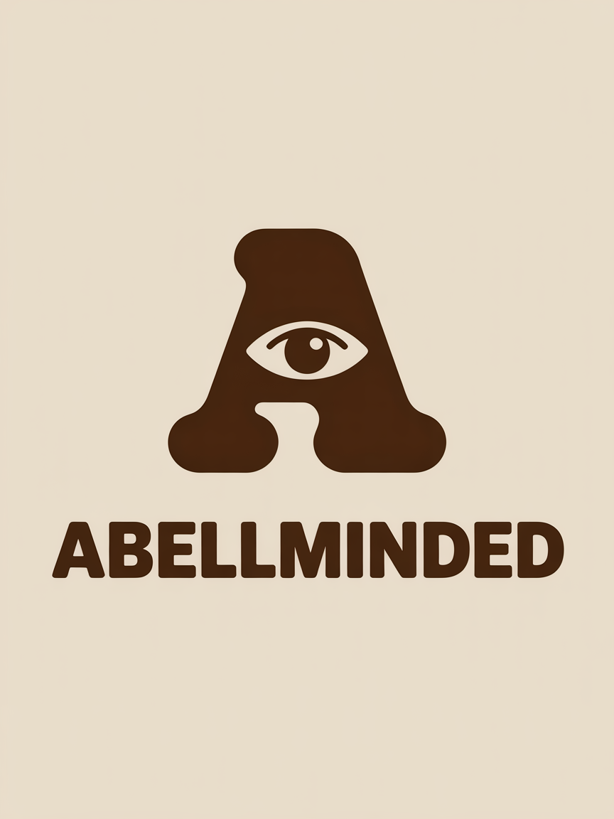
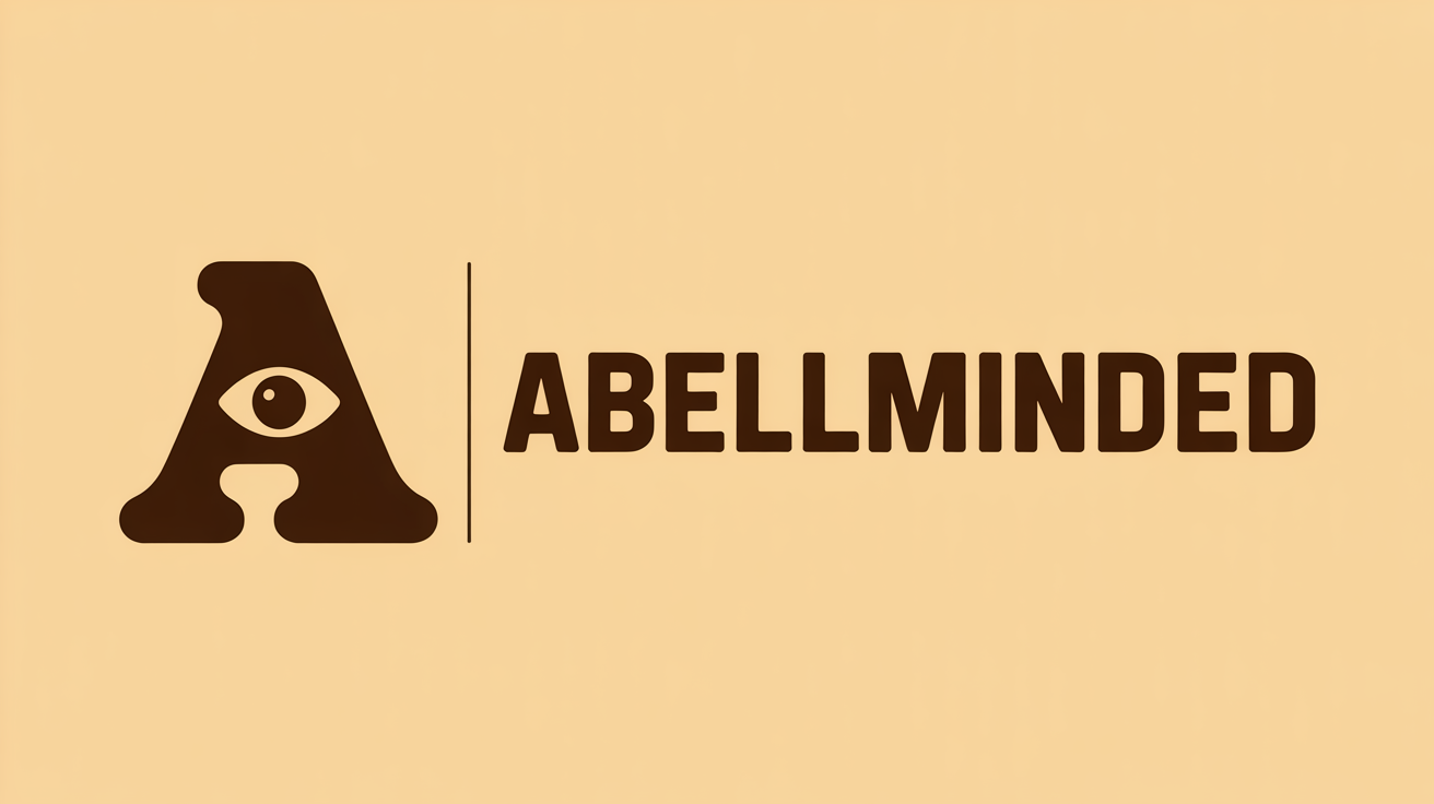
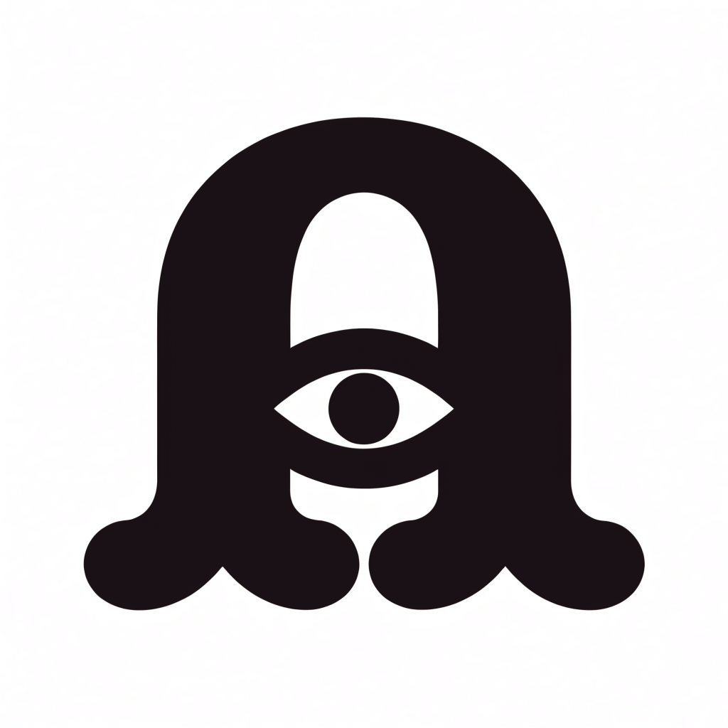
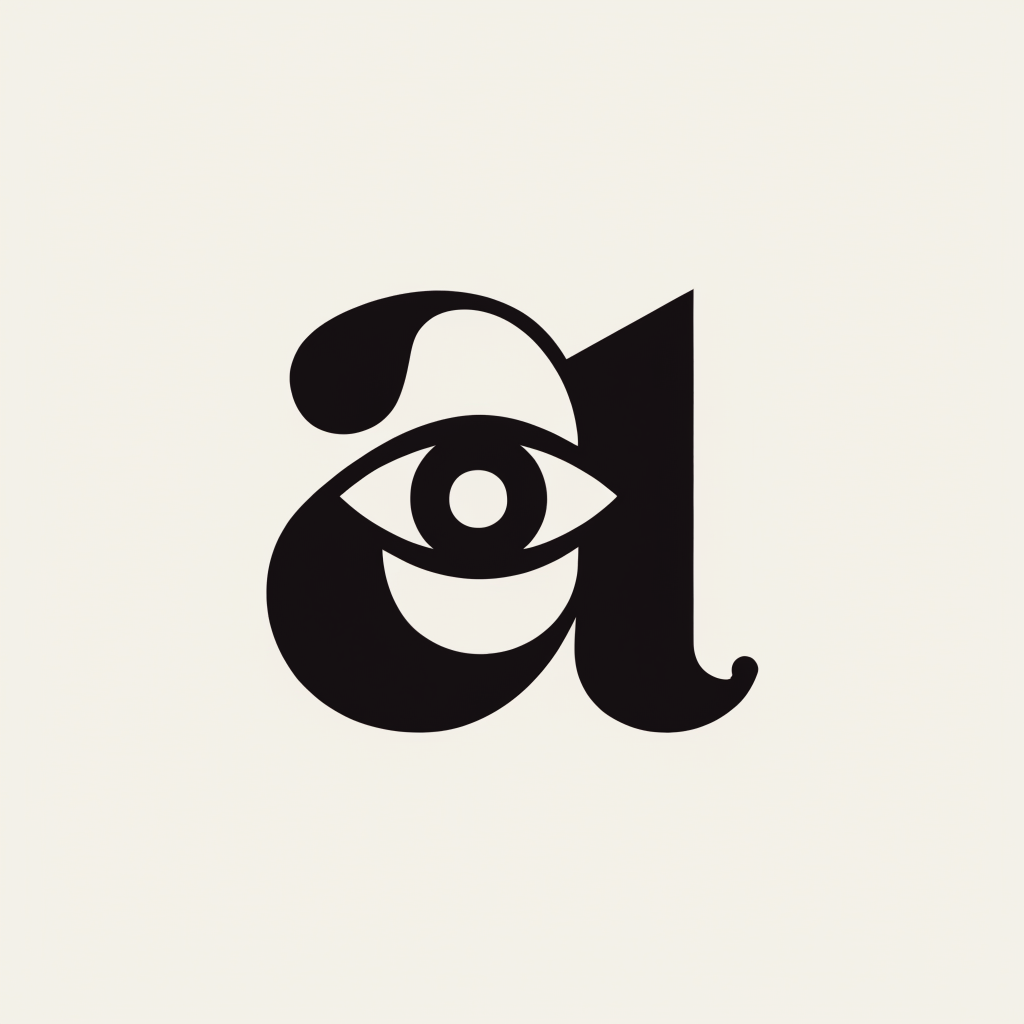
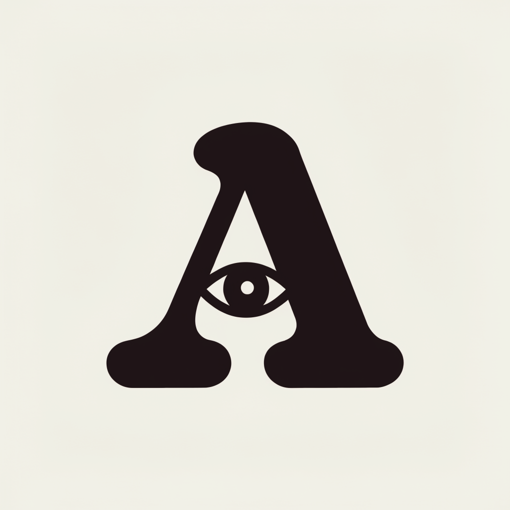
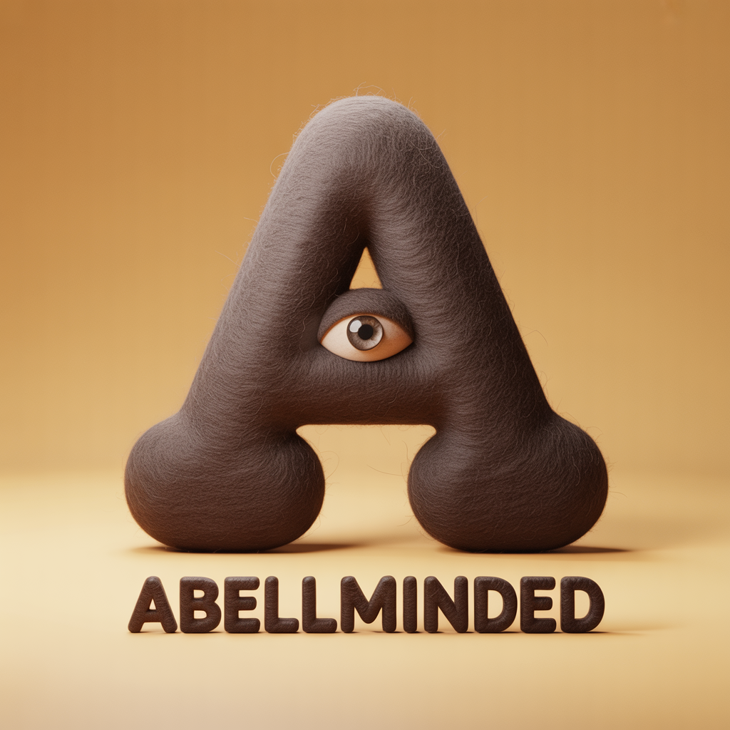
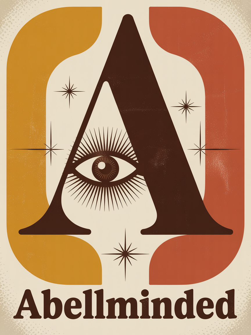
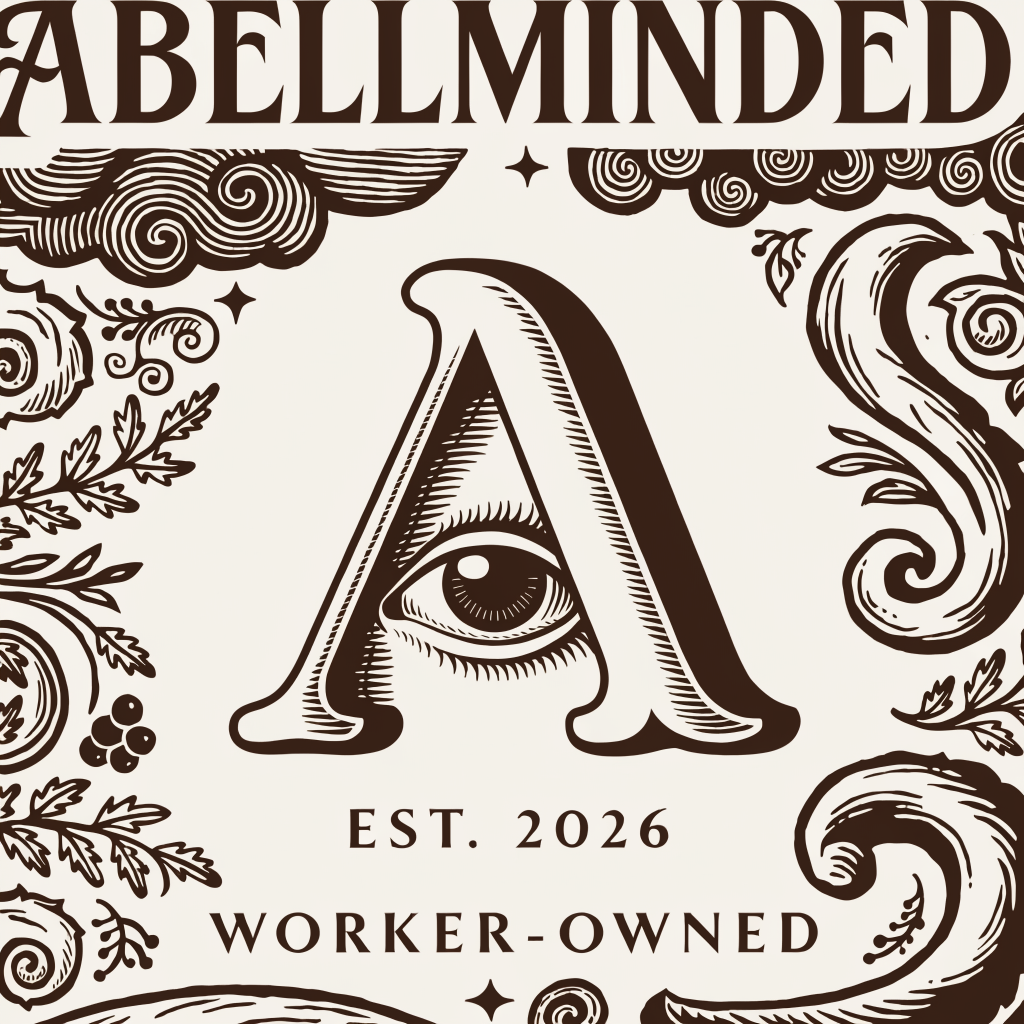
The A-Eye
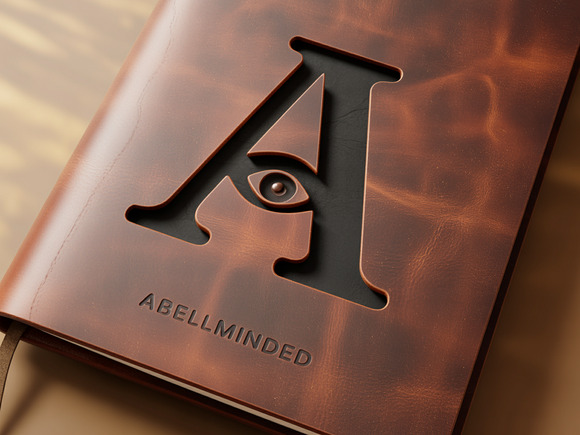
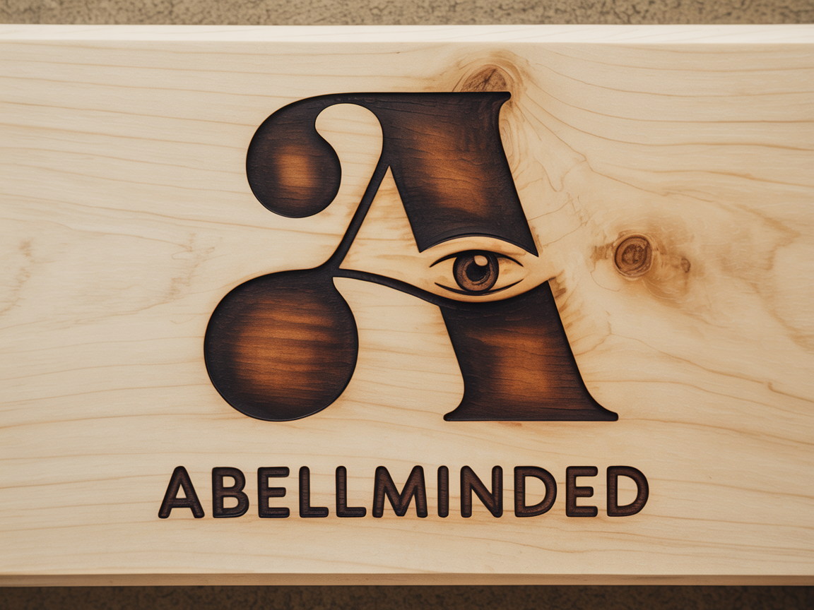
App icons, favicons, embroidery, leather, wood. One eye, always inside the counter. No mouth, no eyebrows, no second eye.
Dark and Light
 Horizontal
 Vertical
 Wordmark
 Horizontal
 Vertical
 Wordmark
Clear Space & Minimum Size
Minimum clear space: the height of the eye, on all sides. The mark needs room to breathe.
Mark only: 24px on screen, 8mm in print. Full lockup: 120px wide on screen, 40mm in print. Below this, use the mark alone.


What Not to Do
Stretch or distort. The proportions are precise.
Move the eye outside the counter. It lives in the negative space of the A.
Add facial features. One eye. No mouth, no eyebrows.
Unapproved colors. Ink, bone, ember, or expanded palette only. No gradients.
Mixed case. ALL CAPS or all lowercase. Never "AbellMinded" or "Abell Minded."
Drop shadows, outlines, or effects. No embellishment beyond approved textures.
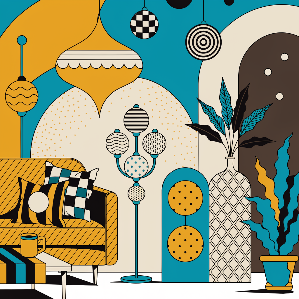
Color System
Three primaries, earned not decorative. Three expanded palettes for “one wrong color” energy. Click any swatch to copy its hex value.
The Foundation
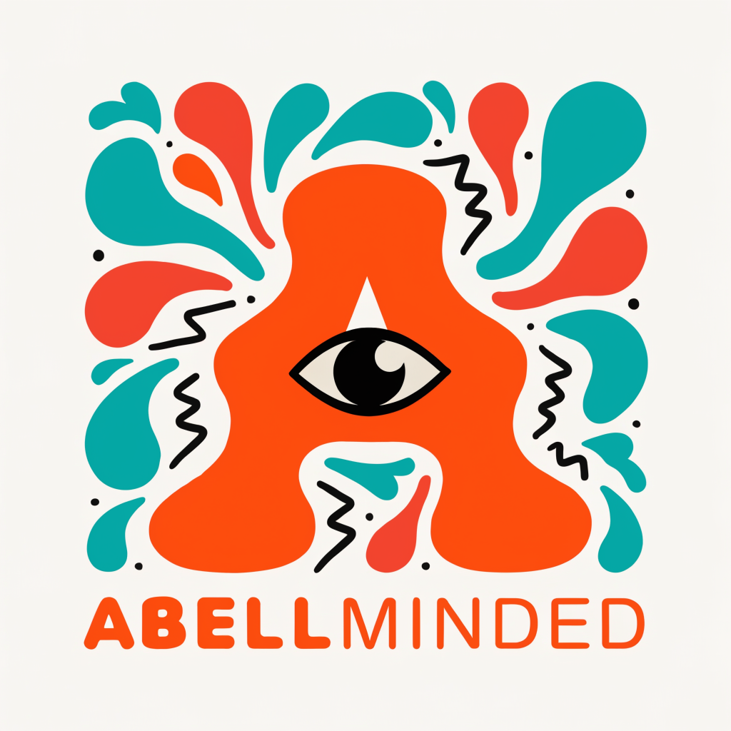
Off-Kilter Combinations
Each pair is intentionally unexpected. Hand-picked by someone with opinions, not generated by an algorithm.
Background & Foreground
Ink on Bone. Bone on Ink. Ember as accent only. The one thing that burns.
One expanded palette per page. The wrongness is the point, but only if the rest stays disciplined.
Mix expanded palettes on the same page. Pick one pair, commit.
Ember as a background fill. It’s an accent, not a surface.
Typography System
Recoleta Bold for the wordmark. Fraunces, Source Serif 4, and JetBrains Mono for everything else.
ABELLMINDED
Recoleta Bold · All caps · Wordmark lockup only
Rounded serif, 1970s warmth. Logo lockup only. If it is not the brand name, it is not Recoleta.
Fraunces
An Able Mind Sees What Others Miss
Fraunces 700 · Variable optical sizing · Display headlines, section titles, pullquotes
Quirky enough to feel human, serious enough to carry a headline. Variable optical sizing gives it range from editorial headlines to intimate captions.
Source Serif 4
Every surface has a history. The ink bleeds into the paper. The grain shows through the wood. The eye watches from inside the letter. Nothing here is decorative. Everything is earned.
Source Serif 4 · 400/600 weight · Body text, long-form reading
Navigation · Buttons · Labels · Data Tables
const brand = "abellminded";
Scale & Roles
Never Use
Inter, Helvetica, Arial, Roboto, Open Sans. Fonts for companies without opinions. We have opinions.
Montserrat, Poppins, Lato, Nunito. The Google Fonts starter pack.
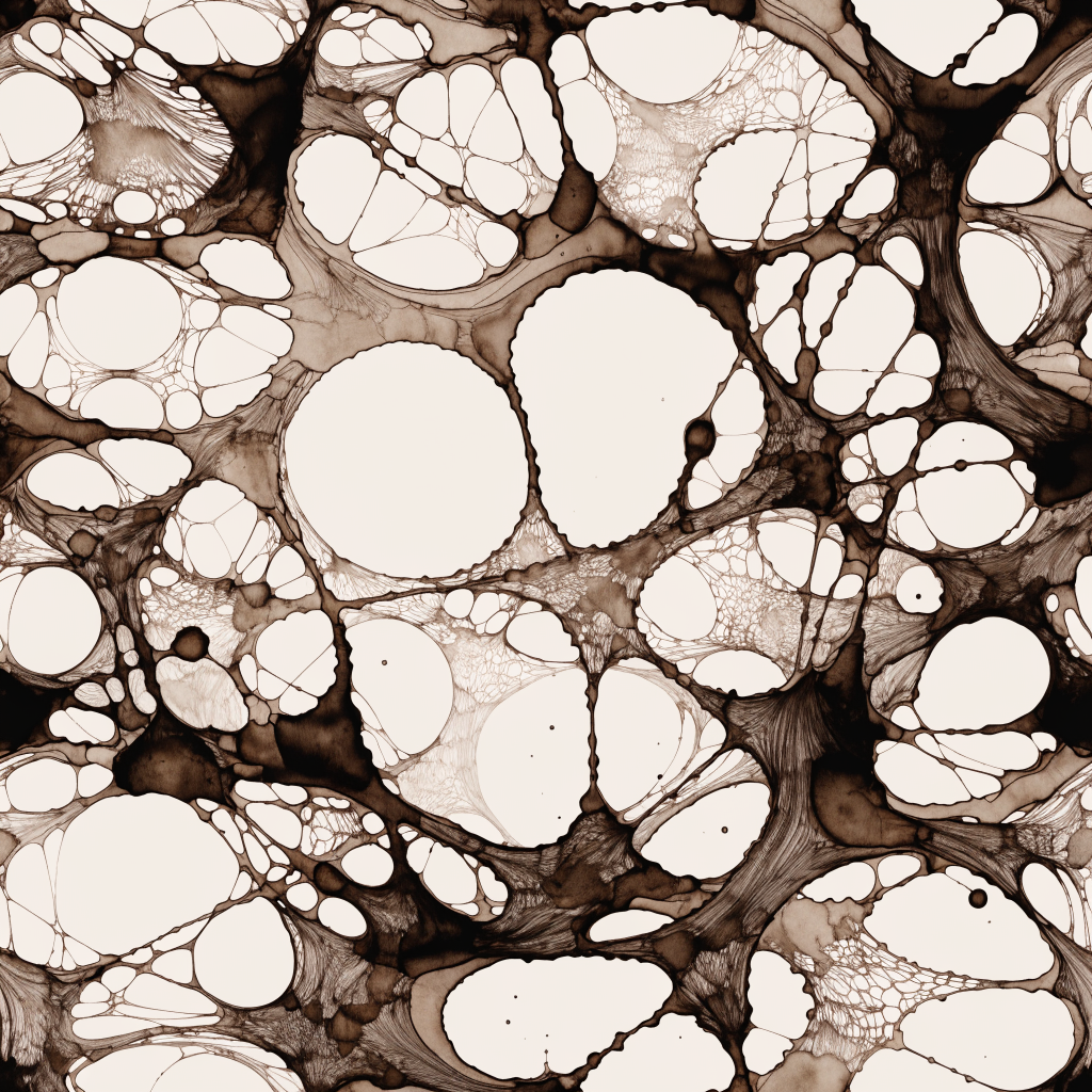
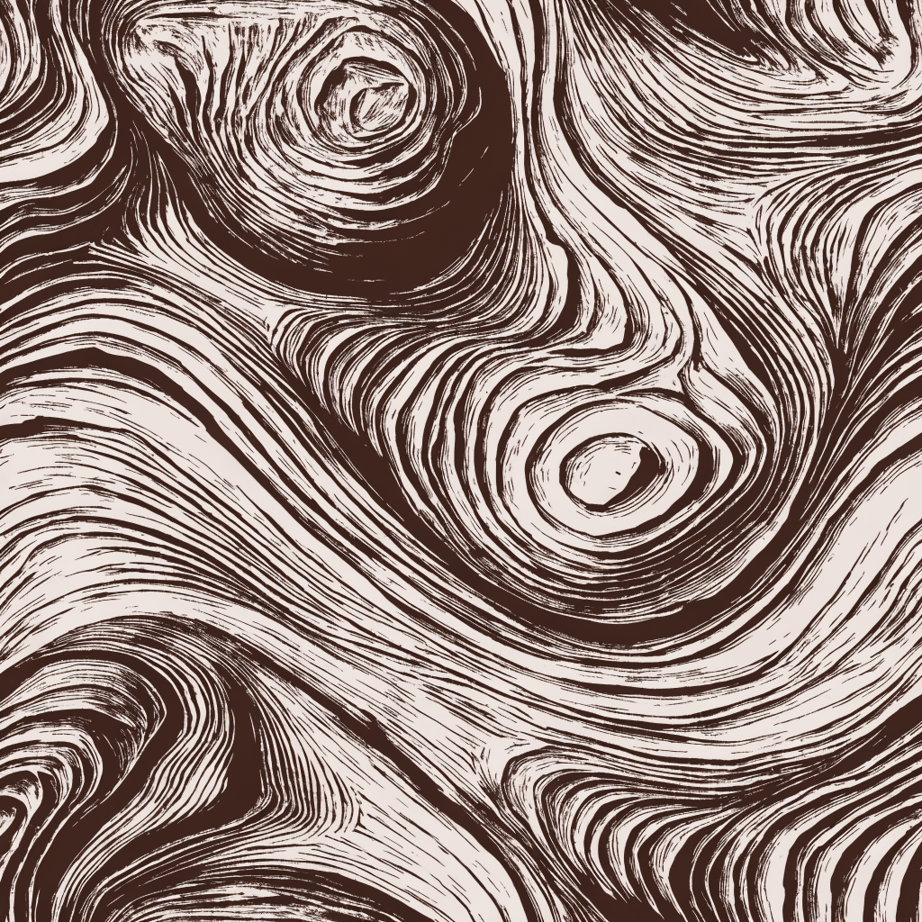
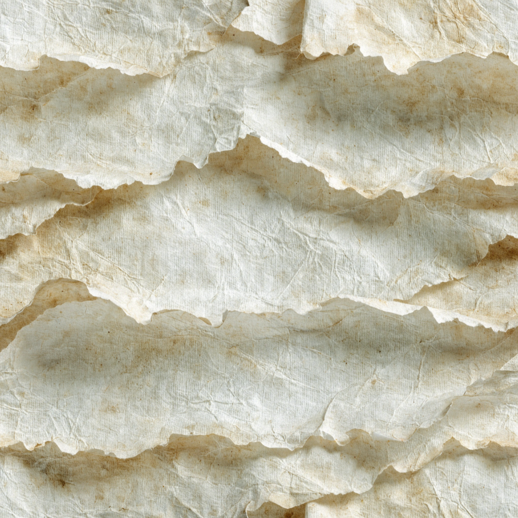
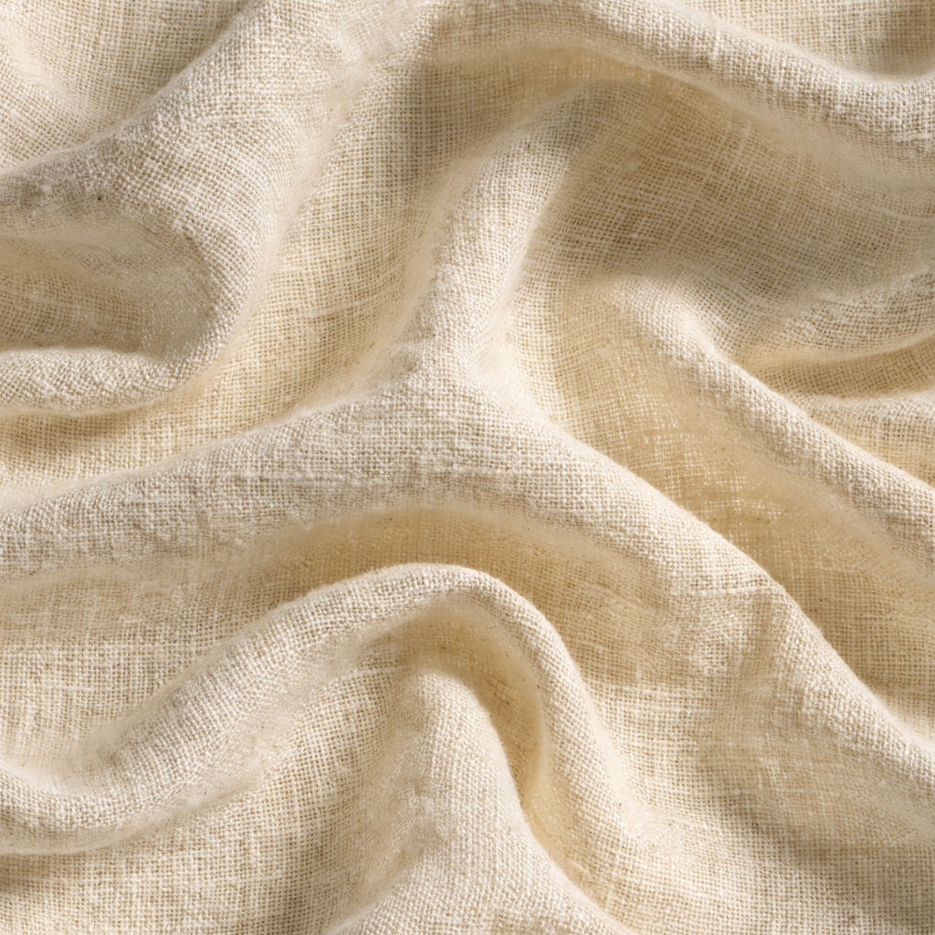
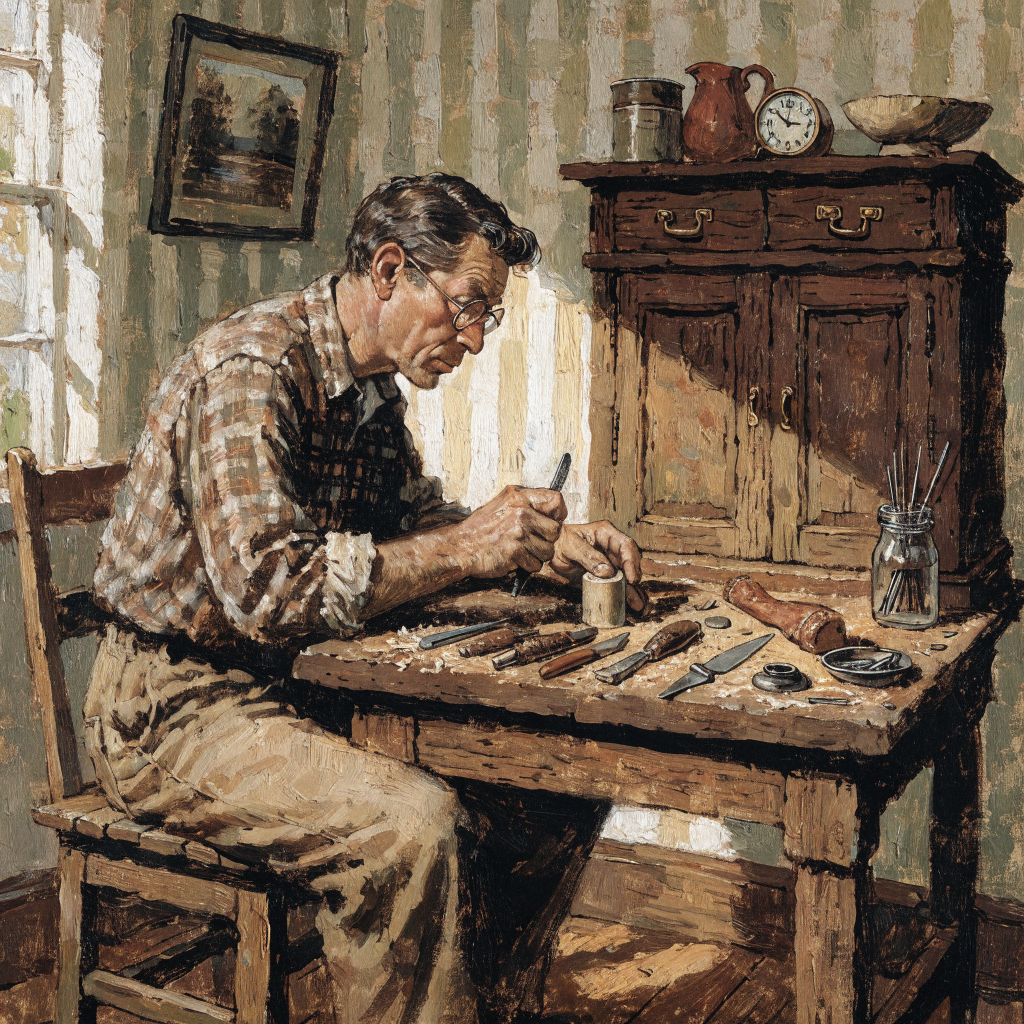
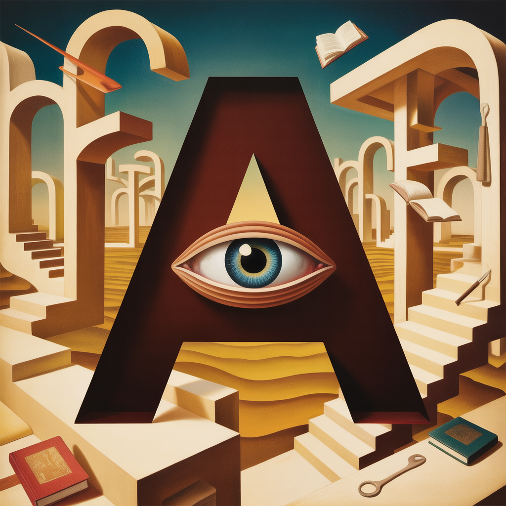
Visual Motifs & Texture
Hand-made, warm, textured. Not a Figma export. Every surface has a history.
Paper, Ink, and Wood
What the Brand Looks Like
If It Needs Drawing
Limited palettes (2-4 colors). Visible printing artifacts. Flat color with texture. Made with hands and tools.
Photorealistic renders. Smooth vectors. Perfect-lighting 3D. Anything from Shutterstock.
What This Brand Is Not
Clean and minimal. We are warm and textured.
Gradient-heavy. Flat color with earned texture, not SaaS landing page gradients.
Icon-heavy. Words, type, and images. An icon grid is a confession you do not trust your copy.
A person who builds things and does not have time to perform caring about the work
Because the caring is already in the work.
Plainspoken
Short sentences. Common words.
Heart-forward
Lead with why it matters to people.
Direct
Put the point in the first sentence.
Working-class
The voice has calluses.
Literate
Know the references. Use them well.
Kind
Challenge ideas, never people.
No em-dashes
Use commas, periods, or semicolons. The absence is deliberate.
Sentence case everywhere
Headlines, buttons, navigation. Never Title Case. Never ALL CAPS except the wordmark.
Attribution
"Built by humans and AI, working as one." Always credit both.
Abell & Co. Subset
The consulting practice. Same family, wearing shoes.
What Carries Over, What Does Not
Inherits from Abellminded
- Primary palette: Ink, Bone, Ember
- Type system: Fraunces + Source Serif 4
- Paper grain, letterpress textures
- The A-Eye as family identifier
Restrained for Consulting
- Expanded palettes: sparingly or not at all
- No fuzzy 3D, no Nick energy, no surrealism
- Lighter texture: paper grain yes, heavy woodcut no
- "Abell & Co." wordmark, not "ABELLMINDED"
Where Abell & Co. Identity Appears
- Proposals & decks Clean, editorial. Ember for emphasis only.
- Business cards Letterpress on premium stock.
- Website Dark editorial, minimal texture.
- Email signatures System font. No mark (does not render reliably).
- Workshops Texture and hand-lettered accents welcome here.
If Abellminded is the workshop, Abell & Co. is the front desk. Same family, never needs to announce it.
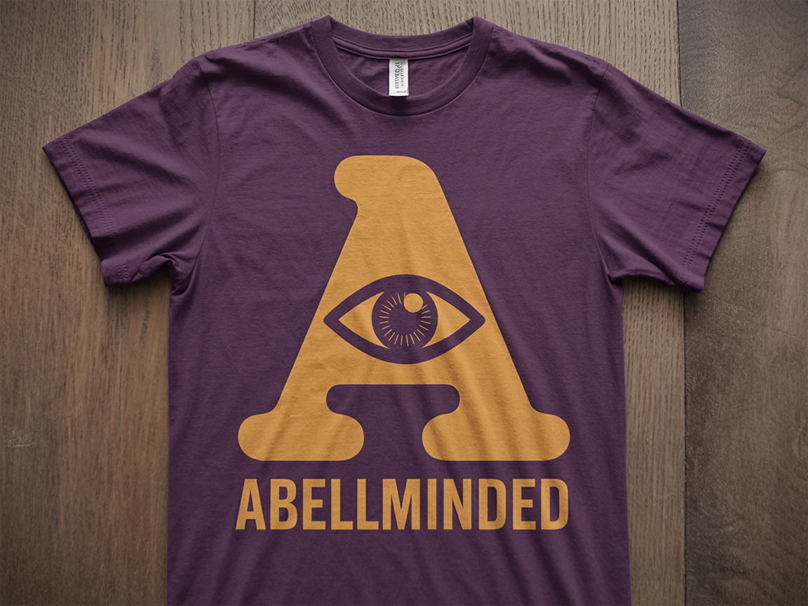
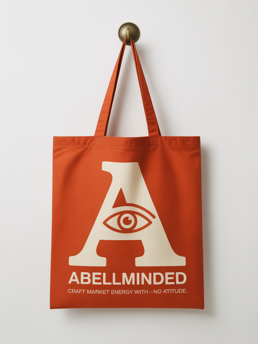
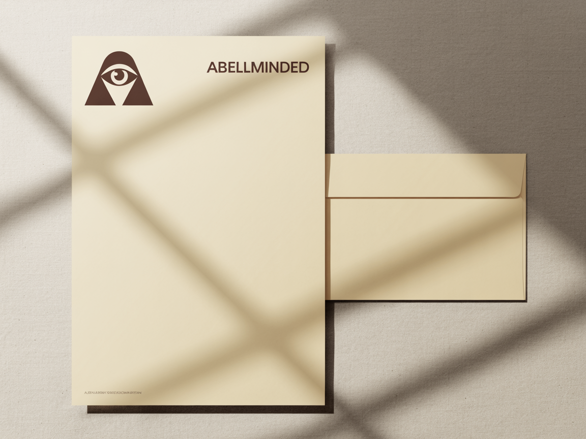
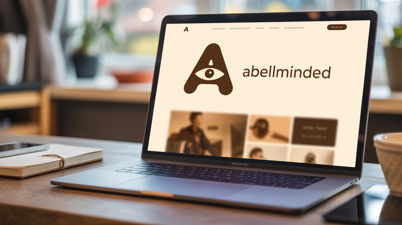
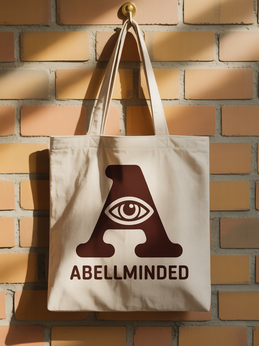
Application Gallery
The identity in the wild.
Standard Applications
Tactile Applications
Expanded Palettes Applied
Stylized Renders
How far the mark stretches while staying itself.